Download PDF
Associate Professor Robin Turner
BSc(Hons), MBiostat, PhD
Director, Centre for Biostatistics
Division of Health Sciences
University of Otago
Dr Claire Cameron
BSc(Hons), DipGrad, MSc, PhD
Senior Research Fellow and Biostatistician
Centre for Biostatistics
Division of Health Sciences
University of Otago
Dr Ari Samaranayaka
BSc, MPhil, PhD
Senior Research Fellow and Biostatistician
Centre for Biostatistics
Division of Health Sciences
University of Otago
Receiver operating characteristic (ROC) curves summarise graphically the trade-off between sensitivity and specificity for diagnostic tests.1 We will describe how to interpret these graphs, but first we need to understand how we assess diagnostic test accuracy and why we are interested in these concepts of sensitivity and specificity.
Diagnostic tests diagnose whether a person has a particular disease or not. They vary in how well they perform. We start by considering what we call the gold standard; this tells us whether the person truly has the disease or not. The gold standard may be imperfect2 (that is a whole other area of research), but is the best test we have. For instance, histopathology might be considered the gold standard test for deciding if a person has cancer or not, or HbA1c to test for diabetes.
The diagnostic test that we want to estimate the accuracy of is compared to the gold standard test. For example, we may have a new (hypothetical) cancer test and we could take 100 people, some who have cancer and some who do not, and we would apply both the new cancer test and the gold standard of histopathology. We can group people into testing positive or negative with the new cancer test, versus which truly have cancer or not based on the gold standard. Table 1 shows the cross classification of people by the new test and gold standard. If the test is positive and they have cancer, this is considered a true positive result. If they test negative and do not have cancer, this is a true negative result. The new test may also give an incorrect result; if the test is positive but they do not have cancer, this is a false positive result and if the test is negative but they do have cancer, this is a false negative result. We can measure how many correct results there are by measuring the per cent correctly classified (the diagonal of the table): 100% x (45 + 40)/100 = 85%.
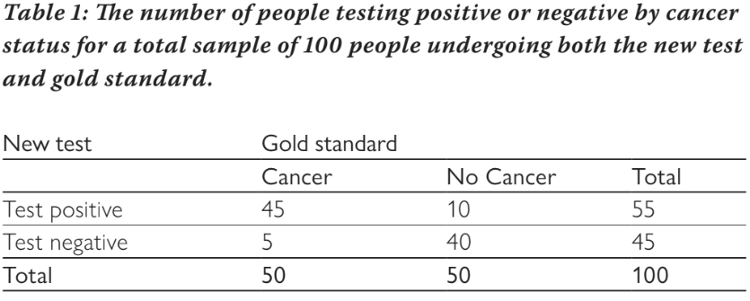
There are four measures of interest: sensitivity, specificity, positive predictive value (PPV), and negative predictive value (NPV). Sensitivity measures the per cent of people who test positive out of all of those who truly have cancer. From Table 1, this is: 100% x 45/50 = 90%. Of all people who have cancer, the test will be positive for 90% of them (and negative for 10%). Specificity measures the per cent of people who test negative out of all of those who do not have cancer. From table 1, this is: 100% x 40/50 = 80%. Of all people without cancer, 80% will test negative (and 20% will test positive). Sensitivity and specificity do not depend on the prevalence of the disease (in this example the prevalence is 50% as half have cancer and half do not) because they are estimated separately for those with cancer and those without cancer. Once there is a test result, the PPV and NPV are useful measures. The PPV estimates the per cent of people who have the disease out of all those who test positive, and similarly the NPV estimates the per cent of people who do not have the disease out of all those who test negative. For our example, the PPV is: 100% x 45/55 = 81.8% and the NPV is: 100% x 40/45 = 88.9%. The PPV and NPV vary as the prevalence of disease changes, so are less useful as measures of test accuracy. For example, if the test were used in a different population with an increased prevalence, the PPV would increase and the NPV would decrease, but sensitivity and specificity would remain the same.
The example above assumes a binary test, i.e. the new diagnostic test provides a positive or negative result, but many tests have a continuous result and a threshold is needed to define whether a test is positive or negative. The cancer test may measure the level of an antigen in the blood, which can take on any value between zero and ten. Table 2 shows how many people have different antigen levels (the new hypothetical test) and whether or not they had cancer based on the gold standard test.
The example above assumes a binary test, i.e. the new diagnostic test provides a positive or negative result, but many tests have a continuous result and a threshold is needed to define whether a test is positive or negative. The cancer test may measure the level of an antigen in the blood, which can take on any value between zero and ten. Table 2 shows how many people have different antigen levels (the new hypothetical test) and whether or not they had cancer based on the gold standard test.
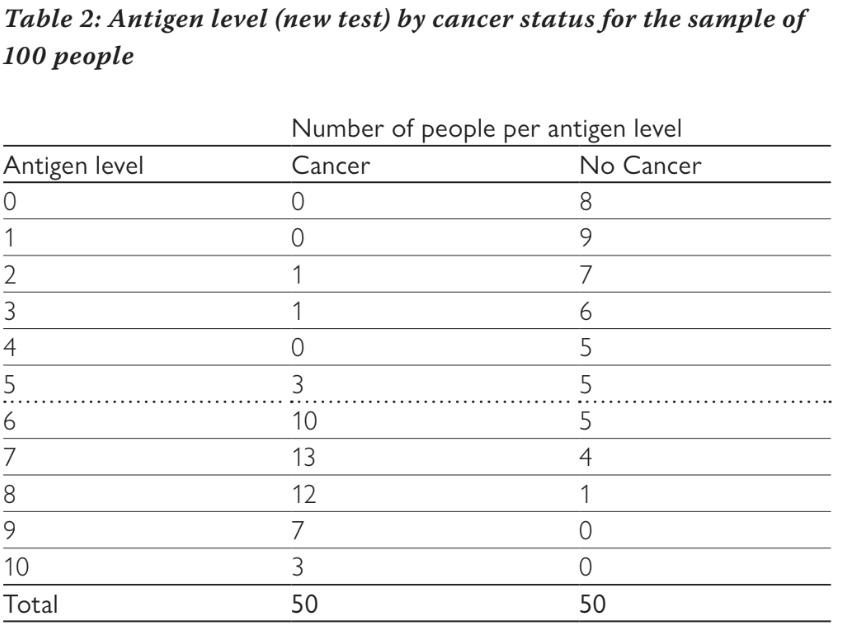
If we choose a threshold of greater than or equal to six to be considered a positive test, then we end up with the numbers shown in Table 1, i.e. anyone with an antigen level of six or more is considered to be positive. In our example, 45 people with cancer had a test result of six or more and only ten of those without cancer had a test result of six or more. We can vary the threshold for a positive test from greater than or equal to zero (where all people test positive), through to greater than ten (where all people test negative) and calculate the sensitivity and specificity at each threshold. This is shown in Table 3. We can see that as the threshold increases, sensitivity decreases and specificity increases. Changing the threshold will always change one at the expense of the other. It is not possible to increase both sensitivity and specificity by altering the threshold.
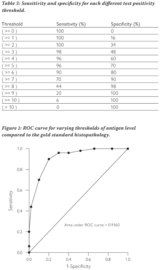
The ROC curve plots sensitivity against 1-specificity to show this trade off. Figure 1 shows the ROC curve for our example. The points show the sensitivity and 1-specificity pairs from the different thresholds (note the graph is showing proportions not percentage as we have used previously, we use these interchangeably). The diagonal line represents if we decided randomly whether the test was positive or negative. Tests with poor accuracy will lie close to this line, tests with high accuracy will be heading towards the upper left corner. A perfect test would have a sensitivity of one and a specificity of one, which would lie in the top left corner.
The area under this curve can tell us how well the test is discriminating between those with the disease and those without the disease. A poor test lying on the diagonal line will have an area under the ROC curve of 0.5; a perfect test will have an area of one. Most tests will lie in between. Our example cancer test has an area of 0.916, indicating it has very good discrimination between cancer and non-cancer.
The ROC curve allows us to make decisions about where a threshold might best be chosen. It is important to note that choosing a threshold is a clinical decision based on whether sensitivity or specificity is more important. If sensitivity is more important, a lower threshold might be chosen. This will minimise false negatives, but will come with worse specificity and thus an increased number of false positives. Increasing the threshold will do the opposite.
In summary, ROC curves have an important use in showing how a test performs against the gold standard across a range of thresholds. It allows easy assessment of which threshold might be better for a particular situation, and the area under the curve gives an estimate of the discriminative ability of the test.
References
About the authors
Associate Professor Robin Turner, BSc(Hons), MBiostat, PhD, is the Director, Centre for Biostatistics, Division of Health Sciences, University of Otago
Dr Claire Cameron, BSc(Hons), DipGrad, MSc, PhD, is a Senior Research Fellow and Biostatistician, Centre for Biostatistics, Division of Health Sciences, University of Otago
Dr Ari Samaranayaka, BSc, MPhil, PhD, is a Senior Research Fellow and Biostatistician, Centre for Biostatistics, Division of Health Sciences, University of Otago
The area under this curve can tell us how well the test is discriminating between those with the disease and those without the disease. A poor test lying on the diagonal line will have an area under the ROC curve of 0.5; a perfect test will have an area of one. Most tests will lie in between. Our example cancer test has an area of 0.916, indicating it has very good discrimination between cancer and non-cancer.
The ROC curve allows us to make decisions about where a threshold might best be chosen. It is important to note that choosing a threshold is a clinical decision based on whether sensitivity or specificity is more important. If sensitivity is more important, a lower threshold might be chosen. This will minimise false negatives, but will come with worse specificity and thus an increased number of false positives. Increasing the threshold will do the opposite.
In summary, ROC curves have an important use in showing how a test performs against the gold standard across a range of thresholds. It allows easy assessment of which threshold might be better for a particular situation, and the area under the curve gives an estimate of the discriminative ability of the test.
References
- Pepe, M S. The statistical evaluation of medical tests for classification and prediction. Oxford: Oxford University Press, 2003.
- Rutjes AW, Reitsma JB, Coomarasamy A, Khan KS, Bossuyt PM. Evaluation of diagnostic tests when there is no gold standard. A review of methods. Health Technol Assess. 2007;11(50).
About the authors
Associate Professor Robin Turner, BSc(Hons), MBiostat, PhD, is the Director, Centre for Biostatistics, Division of Health Sciences, University of Otago
Dr Claire Cameron, BSc(Hons), DipGrad, MSc, PhD, is a Senior Research Fellow and Biostatistician, Centre for Biostatistics, Division of Health Sciences, University of Otago
Dr Ari Samaranayaka, BSc, MPhil, PhD, is a Senior Research Fellow and Biostatistician, Centre for Biostatistics, Division of Health Sciences, University of Otago
